Showing posts with label Creative Guild Ad of the Month. Show all posts

Wednesday, October 22, 2025

528. Creative Guild TV Ad of the Month for April, 1984: TANG ORANGE

TANG is an orange-flavored powdered mix drink developed in 1957 by General Foods Corporation food scientist William A. Mitchell and chemist William Bruce James. It became available in the market by 1959, and its early reputation rested on the fact that it was used by early NASA crewed space flights.

Orange TANG was introduced in the Philippines around late 1970s by General Foods Philippines, Inc. and enjoyed a successful launch due to its American image. The first commercials that were aired were Australian productions, but in the 1980s, Hemisphere Leo Burnett was appointed as the  local agency to handle its marketing communications. Mr. Greg Garcia handled the account and his team improved on the Aussie commercials, visually and musically.

The TANG TV commercial that was aired in April 1984 featured lush visuals, a new jingle composed by ace composer Ed Gatchalian, while integrating the signature “orange drop” shot that TANG was famous for.

TANG, "Share the Feeling" Campaign, 1979

Since then, TANG has introduced a world of flavors also in pouches and packs, like Guyabano, Grape, Calamansi, Apple, and many more. The TANG  brand is currently owned in most countries by Mondelēz International, a North American company spun off from Kraft Foods in 2012. The Philippines continue to be a topmarket for TANG, along with Brazil and Argentina.

 CREDITS:

AGENCY: Hemisphere Leo Burnett

ECD: Gregg Garcia

COPYWRITER: Patch Falgui  / ART DIRECTOR: Raffy Velasco

JINGLEMAKER: Ed Gatchalian

CLIENT: General Foods Philippines Inc.


Thursday, August 10, 2023

435. 1994 Creative Guild Ad of the Month for July: MOTOLITE “Tawid” TVC 30s

July 1994 Winner!! MOTOLITE "Tawid" TVC by Basic/FCB

Humor is the charm of this MOTOLITE Brake Fluid TV ad that won a nod from the Creative Guild judges as the best commercial for July 1994. Blame it on the hyperbolic acting of the well-cast talents who dramatized to the max the fear of being run over by a brake-less vehicle. 

The over-the-top acting was so sit-com funny, that the models could give even present-day comedians a run for their money. The composition of the shots and the editing added to the ridiculous hilarity of the situations. The judges weren’t even looking at the production design (was there any?) or listening to the score gone haywire--they were just riveted at the paradoxical effect of the comedy happening in the face of impending tragedy. Now that’s funny!!

CREDITS

Advertiser: CC. UNSON
Product: MOTOLITE

Agency: BASIC ADVERTISING
Creative Director: BOY LEUTERIO
Copywriter: EMIL REINTAR
Art Directors: REY TOLENTINO / EGAY OLIVA
Artist: PETE CLEMENTE
Producer: PAM PAJARILLO
Caster: TESS GELLA

Production House: ELECTROMEDIA
Director: MANDY REYES
Producer: MERIE VILLAMAYOR
Cinematographer: LESLIE GARCHITORENA
Prod. Designer: GAY GUILLERMO
Post Production: VIDEOPOST
Recording Studio: HIT PRODUCTIONS
Sound.Music Composer: BRIAN CHUA


Wednesday, June 28, 2023

428. Creative Guild Print Ad of the Month for May 1984: JOLLIBEE "THE CHAMP" Langhap-Sarap

BIG LANGHAP SARAP WINS BIG! Creative's Choice for May 1984

The CHAMP “Langhap-Sarap” ad was an introductory campaign of Jollibee ‘s new product intended to be the top of Jollibee’s line of hamburgers and a major competitor of McDonald’s Big Mac. Having noticed that Jollibee is the only hamburger in the country that has a nice smell. Basic’s creative group led by creative director Minyong Ordoñez emphasized this aspect and came up with “langhap-sarap”, which literally means “smell good”. Furthermore, it dramatized the taste superiority of the CHAMP, it having a cooked-in taste that is not present in American burgers. The CHAMP patties boast of being not just plain patties but complete with seasonings, onions, and even enriched with egg.

 “Sapin-sapin ang sarap” was used to introduce the CHAMP’s other fillings like lettuce, tomatoes, pickles, mayonnaise and catsup. Each new ingredient was color printed for emphasis , were pasted together, before finally shot into a transparency, the end result of which is the colored ad of “Chomp, chomp, the CHAMP”.

 CREDITS:

ADVERTISER: JOLLIBEE CORP.

AGENCY: BASIC ADVERTISING

Creative Director: Minyong Ordoñez / Art Director: Roy Babia

Account Executive: Achie Sy / Print Producer: Gerry Arellano

Photographer: Eddie Go / Food Stylist: Lydia Go

SOURCE: ARAL Newsletter issue 1984


Saturday, April 2, 2022

368. Creative Guild’s TV Ad of the Month for Jun. 1996: JAG ANTI-FIT “Merman”

JIMENEZ DMB&B's winning ad for Jag Anti-Fit, aired June 1996
Jeans ad featuring merman makes waves

(from a PR article published in the Philippine Star and Manila Bulletin, Sep. 1996)

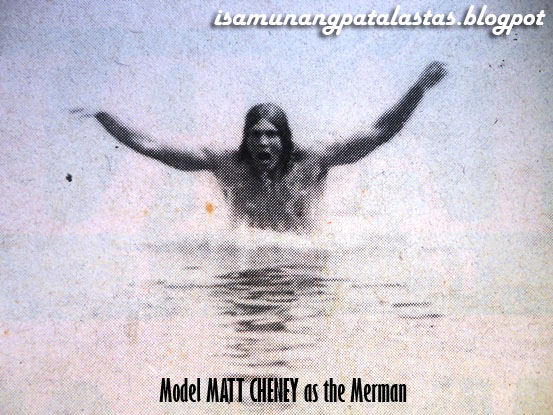
The new JAG Anti-Fit commercial is making waves, literally, with its focus on a mythological sea creature. Titled “Merman”, the ad is catching the fancy of viewers. It features a man shown swimming with a fishtail, then removing it afterwards to put on a pair of JAG Anti-Fit Jeans.

Using a merman as model for denim jeans is indeed a fresh idea,

Australian model MATT CHENEY, a competitive swimmer, and did all the swimming scenes in the ad.

“We had to think Anti-Fit. I think this is synonymous to being rugged, daring, comfortable and even controversial”, says Jun Reyes, the commercial’s director.

“When we say jeans, it usually refers to tight-fitting denims, so the idea behind the commercial is to show how we can feel comfortable with jeans”, adds Alex Castro, who collaborated with Reyes on the JAG ad. “ We fitted a man with the tail of a fish to show how constricting denims can be. It shows the limitation of movement. It is not relaxed, not comfortable. Then we show JAG breaks out of the denim stereotype”.

 WATCH JAG ANTI-FIT "MERMAN" TVC HERE:
Source: JAGJeansPh

To make the commercial work, the team relied on realistic props and materials. Says Reyes, “it took hours to put the fish tail on the model. He had to wake up at 4 a.m. for the make-up artist to work on him. We really made sure that the tail would appear as though it was a part of him. We used prosthetics so that the tail would look real. And the tail was detailed for the model so that it would not make him uncomfortable. We had a another tail on reserve in case it got damage. The model had to be carried by 4 men to the beach.

JAG ANTI-FIT "MERMAN' TVC SHOOTING IN BOLINAO, PANGASINAN

Choosing the ideal site for the commercial was also crucial. The shoot was shot in 2 locations: Anilao, Batangas for the underwater scenes, and Bolinao, Panagsinan for the beach scenes.

Reyes and Castro said the commercial was easy to do. They shot the underwater scene for a day, and the scenes above the water overnight.

Since models count a lot in the success of a commercial, JAG made sure they had a perfect merman in its ad. “We had to look for a model who is rugged and suave at the same time. These qualities we found in Matt Cheney, who is a swimmers and a model from Australia. He was paired with Carol Dunbar to add appeal to the commercial. Together, they epitomize the image of JAG—young, spirited, adventurous”, Reyes explains.

The prosthetic fish tail was molded on the model's body

Mythological creatures, gorgeous bods, and a cool concept. With all these elements combined, the JAG Anti-Fit commercial is already making a big splash on TV screens.

NOTE: JAG ANTI-FIT ‘MERMAN’ TVC was adjudged by the Creative Guild of the Philippines for the month of September 1996.

CREDITS:

AGENCY: JIMENEZ DMB&B

Copywriter: ALEX R. CASTRO / Art Director: NIKKO CORNELIO

Producer: PAUL SUAREZ / Account: ANNA DOMINGO

PRODUCTION HOUSE: UNITEL

Director: JUN REYES

D.O.P. BOY YÑIGUEZ, LEE BRIONES / Editor: IKE VENERACION

Production Design: TOMMY NG / Executive Producer: Deet Castillo

ADVERTISER: FIL-PACIFIC APPAREL INC.

Marketing Manager: Veng Taningco / President: Angeline Siy

SOURCESJAGJeansPh, youtube video /  Manila Buletin, The Phlippine STAR press releases.


Thursday, March 24, 2022

367. Creative Guild’s TV Ad of the Month, Aug. 1987: DEL MONTE SPAGHETTI SAUCE “Godfather”

The Creative Guild of the Philippines, an association of creative personnel working in the advertising industry, was just 3 years old when the 1987 Creative Guild Ad of the Year Awards night at the refurbished Metropolitan Theater was staged. One of the frontrunners for the Ad of the Year was DEL MONTE SPAGHETTI SAUCE’s “Godfather”, a much-talked about TV ad produced by McCann Erickson for Del Monte Phils.

WATCH THE DEL MONTE SPAGHETTI SAUCE 'Godfather" TVC HERE:

To drive home the “Italian-ness” of the product, the agency made use of the iconic Don Vito Corleone, a fictional character in Mario Puzo’s “The Godfather”, ably essayed in the 1972 film by Marlon Brando. McCann caster Amy Salona found a talent in the person of Enrique “Ricky” Rivero, an occasional stage actor, who, when fully-made up, became Brando’s doppelganger—right down to his raspy voice.

TV viewers took notice of this well-produced, imported looking commercial, what wit its authentic production design,  moody lighting, the supporting characters, and most especially, the uncanny duplication of the “Godfather’s” look and the cast's superb acting. It was no wonder then that the Del Monte commercial was chosen as the TV ad of the month for August 1987,  by a jury consisting of agency art directors, creative directors, copywriters and producers.

In the grand awards night, however, Nestle’s MILO “Gymnast”, headlined by SEA games gold medalist Bea Lucero,  edged out the DEL MONTE’s “Godfather”, for the plum TV Ad of the Year prize. But Enrique Rivera’s portrayal of  the “Godfather” was so unforgettable that he was  honored as one of the 10 Best Commercial Models of the Year. He was cited for his ‘effective portrayal of a distinctive character in the most natural and realistic manner, through skillful acting that captures the drama between product and consumer'.

DEL MONTE'’s “Godfather” would win more technical awards at the next Philippine Advertising Congress, but the best  was yet to come. In 1990,  the same Del Monte brand will win top honors at the  Creative Guild TV Ad of the Year for the commercial “Novices”, the most prized award for the evening. For McCann Erickson, the feeling was just—magnifico!

SOURCES:

Creative Guild Ad of the Year 1988 program

Youtube: 1986 Del Monte Spaghetti Sauce TVC, https://www.youtube.com/watch?v=a_s1c2CNLws

Thursday, March 17, 2022

366. Creative Guild’s 1990 TV Ad of the Year: DEL MONTE SPAGHETTI SAUCE, “Novices” TVC 45

The 1990 Ad of the year reeks of foreign (specifically Italian) flavor, but was actually a locally-written, locally-produced effort full of recognizably Pinoy values and pushing a product that is an apparent bestseller among Filipino housewives.

“Novices” was a 45-sec. TV ad created by McCann-Erickson for Del Monte Philippines’ unadulterated spaghetti sauce, touted as having the most authentic Italian flavor because of its generous serving of herbs and spices.

“Del Monte had been a McCann client “forever”, recalls president Emily Abrera, who was both writer and creative directors for the ad. “When I joined the agency 17 years ago, they were already here.”McCann had already launched the product a couple of years earlier with a hugely successful spoof entitled “Godfather” featuring a Vito Corleone/Marlon Brando deadringer an won raves for the ad’s production values,

“Clients wanted something just as good,”Abrera says, “and the idea was still to do something sort of Italian,” to again underscore the product’s authentic flavor.”

 A commercial full of nuns was not the first storyboard approved for productions; the original idea was to stage a raucous family gathering in the true Italian tradition.

“My father is Italian”, Abrera asserts,”so there was certainly a lot of noise in my family!”. Everybody thought that the nuns would be more unusual, however, and then account manager Rosanna Henares went as far as consulting real-life sisters about the idea.

 WATCH DEL MONTE SPAGHETTI SAUCE "Novice" TVC Here:

Uploaded by Kape WithCream

The images were ideal; the convent  setting, with its cast of hard-working, industrious residents, stressed the points of ready-made product that tasted as heavenly as the traditionally-prepared favorite. (“Two hours, mother!”, one of the novices exclaims), and the Mother Superior, sublimely played by stage actress Benita Steiger (the production had to wait until Steiger returned from a London vacation), was the epitome of domestic authority whipping up meals with divine mandate. “Remember, it’s a Christian country,: Abrera says of the Philippines, ‘and nuns are always taught never to take credit.”

 As the possibility of offending the religious sensibilities of viewers, Abrera changed the final line from”Praise the lord”, to “Praise Him”, which Steiger delivers with upturned, knowing eyes in response to the novice’s compliment,  “Praise you Mother.” 

BENITA STEIGGER, with Repertory Phils. Actors

The end copy, “Preferred by mother” is the ideal double-entendre endorsement  from both the domestic and religious sectors. “There was definitely a chuckle factor, but we didn’t want to make fun of anybody,”Abrera says. It was certainly more charm than humor.

The ad was shot in 3 days in te arched ruins of an abandoned Manila bank building that looked appropriately solemn with proper lighting and set design. Once again, casting proved critical. “We wanted young girls who looked absolutely virginal,” Abrera says, “and this was one of those cases where, if you didn’t have the right faces, the ad wouldn’t work, even if you had a good idea.”

The youngest talent was 12 years old, and the carefree lasses were not above lifting their heavy cheesecloth costumes between takes to air their sweating legs. Smoke, camera filters, Joey Luna’s ethereal; production design on a low budget, and Butch Perez’s inspired direction contributed to the making of a polished, truly different commercial with an underlying Filipino sensibility.

“Oh, but we have a lot of common with the Italians, don’t you think?”, Abrera asks, Enoighto proper; Del Monte Spaghetti Sauce to the top of its market.

CREDITS:

AGENCY: McCann-Erickson    /    ADVERTISER: Del Monte Philippines

PRODUCT: Del Monte Spaghetti Sauce

CREATIVE DIRECTOR/ COPYWRITER: Emily Abrera

ART DIRECTOR; Ding Villamor   /   PRODUCER: Baby Enriquez

DIRECTOR: Butch Perez

CINEMATOGRAPHER: Rody Lacap  /   EDITOR: Billy de Leon

PRODUCTION DESIGNER: Joey Luna

PRODUCTION HOUSE: Electromedia

 REFERENCES:

Article lifted from: PERFECT 10: A Decade of Creativity in Philippine Advertising, edited by Butch Uy, p.54

Photo of Benita Steiger: FB page of J. Virata.

DEL MONTE SAUCE NOVICE 45s: https://www.youtube.com/watch?v=cfujgpORNCA, uploaded by kapewithcream

Monday, September 14, 2020

296. Where Are They Now? THE MANOEUVRES of CO.B Perfect Company, 1994

 COMPANY B TRADE AD FOR ISETANN,1994
In the late 80s and 90s, the MANOEUVRES were one of the hottest male dance groups in the country, along with Streetboys and Universal Motion Dancers. Established  in 1984 as WEA Dynamics, and later Octo-Manoeuvres, by WEA Records, the original dancers-- Uriel Policarpio, Ronnel Wolfe , Jon-Jon Supan, Rene Sagaran and Jojo Lapena—promoted music records by way of dance on TV and in events.  Brothers Jason and Joshua Zamora, and Jon Cruz later joined the group.

The dancers gained notice when they supported Gary Valenciano in his blockbuster major concert “Pure Energy” at the Folk Arts Theater in 1987. Their career as male dance group would be linked with Gary V, when Genesis Entertainment—a talent management group under  Gary’s wife, Angeli Pangilinan—signed them up. They became simply known as MANOEUVRES.

The MANOUEVRES took the concert scene by storm with their participation in the concerts and other events of the country’s biggest and most popular entertainers—from Regine Velasquez, Sharon Cuneta, Jaya to Martin and Pops. But it was with Gary V that they were most associated with; head choreographer Uriel Policarpio choreographed many of the “hataw” moves that the energetic singer  did in many of his concerts.

The group became visible in TV dance shows, noontime programs and even had stints in Southeast Asian countries, Canada, U.S., Italy and East, performing for the overseas Pinoy market. In time, the MANOEUVRES were holding their own dance concerts (even a 25th anniversary concert)  that were always sold out.


With the measure of fame the group achieved, the MANOEUVRES managed to snag a few commercial endorsements  that included blue chip clients like Magnolia, Royal Tru-Orange and Coke. One fashion brand they also promoted in 1994 was CO.B (COMPANY B. )  a flagship brand of Tri-Union International, a big apparel company that created a youth line of denims and tops.

Four members—Uriel Policarpio, Jonjon Supan, Jason and Joshua Zamora appeared in trade ads of CO. B, on leading newspapers and magazines. They were  featured in a TV 30s  spot ,”Voices/Dances/Strings”, which became a Creative Guild Ad of the Month in 1994. The commercial was created by Hemisphere-Leo Burnett, led by Creative Director Maun Bondoc, Lilit Reyes and Betsy Baking.

Many of the members used their showbiz exposure to venture into other fields like Acting and directing, in the case of the Zamora brothers. Jon Supan became a managing Director of Hotlegs. But almost all of the original members including Uriel Policarpio (who fully recovered from a quadruple bypass)  and Rene “Mr. Flex” Sagaran continue to be involved in dance, conducting workshops and choreographing numbers for shows.

UPDATE! The 4 MANEOUVRES Today

The MANOEUVRES are still very much around and active today, with new generation members. Their FB group states that they are now under the management group of Artistation, Inc., handler of some of the biggest names in show business today.

SOURCES:
Photo Updates: FB Maneouvres FB Page
Photo Co.B. 1994 Souvenir Program Creatuve Guild Ad of the Year
Retro-5: Memorable Dance Groups in Recent History, 

Friday, May 8, 2020

278. Creative Guild’s 1986 Print Ad of the Year, P&G Phils., IVORY “Purity”

IVORY "PURITY" PRINT AD,  1986 Creative Guild Print Ad of the Year

ISA MUNANG PATALASTAS CONTINUES  ITS  TRIBUTE TO MR. RAMON R. JIMENEZ JR. (14 Jul. 1955/d. 27 Apr. 2020),, or simply MONJ to his colleagues, whose passing at the age of 64 is mourned the Philippine advertising industry that he inspired. After his illustrious career, he was named as the Secretary of the Department of Tourism, promoting the country via his well-received and hugely successful campaign “It’s More Fun in the Philippines” . Before he left Ace-Saatchi & Saatchi in 1988 to join wife Abby in their agency, Jimenez &Partners, MonJ was a VP-Creative and Executive Creative Director at Ace-Saatchi & Saatchi. One of his blue chip P&G accounts was IVORY Soap. Here is the story behind the print ad he helped create with his concept team, and which went on to bag the 1986 Creative Guild of the Philippines Print Ad of the Year.


**********
In 1986, clients and agencies wth a prevailing fear of white space were thrown off their swivel chairs by what appeared (or, in this case, didn’t appear) in several major newspapers. The full page was prited in special white paper and bore the headline, “You are looking at IVORY PURITY”. The text was printed, in an appropriately delicate  type, and the visual was simply a blank space framed by thin black border.

Ivory Phil. Ad, 1930s
The ad, “Purity”, was Ace Compton’s second winner, and was made possible by the fact that “ we were feeling a lot braver,” says Jimmy Santago. The client was global manufacturing giant Procter & Gamble, a Compton client for some 38 years  at the time the revolutionary ad was run, and this was the company’s third attempt at launching IVORY SOAP. “After two failures, it was no longer that sensitive a product.” Recalls Santiago. “The market was tired of it.” Santiago credits the brilliance of "repositioning” with reviving public interest in IVORY and taking its Philippine sales figures to unprecedented new heights.

The first two times it was launched , IVORY had been marketetd first as a soap for teenagers, and then as a family bar. The provincial teen markets, accustomed to heavily perfumed toiletries, also didn’t take too well to IVORY’s non-existent scent. Plus, the agency had to reckon with Filipnos’ completely different—and for the product, potentially damaging –-concept of “purity” at that time. “Pure was understood to be harsh, or concentrated, like a detergent,” Santiago recalls. The description was giving everybody the wrong idea.”

The time came to launch IVORY anew as a baby soap and an exceptionally pure product. The creative team was likewise in a fix about presenting a baby soap wthout unleashing the babes. Baby-filled ads were already the specialty of main competitor Teneder Care—“and we certainly  didn’t want Tender Care to sell any more soap!”Santiago says.

All of Compton’s creative teams were thus invted to pitch ideas for the xciting new projects, and art directors instinctively began by doodling babies—until Santiago declared it was time to leave the babies to someone else. He suggested a blank piece of paper, whiter than standard ash-colored newsprint, whose dirty color simply wouldn’t get the message across. Art director Melvin Mangada, then a fresh college graduate, framed the page n the simple black border, and writer Isabel Gamboa provded the straightforward copy highlighted by the brand logo. “The PUREST SOAP there is,” the copy reads, key words were capitalized for effect, and readers looking down at the white expanse couldn’t help but agree that, yes, this was as spotless as you could possibly get.

BACK TO BABIES. Ivory Ad, late 1986
The ad was a complete surprise. It broke several rules, not the least of whch was the tried and tested procedure of sung a baby to sell a baby product. The absence of a cute face seemed like a sure step towards marketing disaster. Also, client Procter & Gamble was an advertiser traditionally averse to wasting space or departing from bestselling formulas. “Cases like these are exceptions,” Santiago says, because you’re out there to jolt the market. Procter & Gamble’s  General Manager was pleasantly jolted himself, enough to call the ad “brilliant” and refreshingly “discontinuous”.After a time, however, client “got worried,” Santiago recalls, and eventually succumbed to convention by running more baby ads. “But after ;etting us come up wth the ad we wanted, it was alright,” Santiago laughs—especially after “Purity” won a Clio citation.

CREDITS:
AGENCY: Acre Compton Advertising, Inc.
ADVERTISER: Procter & Gamble, Philippines
PRODUCT: Ivory Soap
CREATIVE DIRECTOR: Mon Jimenez Jr.
COPYWRITER: Isabel Gamboa
ART DIRECTOR: Malvin Mangada

Tuesday, April 28, 2020

277. 1989 Creative Guild’s Radio Ad of the Year: Glaxo’s DEQUADIN , “Do Re Mi” RC 30s.


(THIS WEEK’S POST IS A TRIBUTE TO MR. RAMON R. JIMENEZ JR. (14 Jul. 1955/d. 27 Apr. 2020),, or simply MONJ to his colleagues, whose passing at the age of 64 is mourned the Philippine advertising industry that he inspired. After his illustrious career, he was named as the Secretary of the Department of Tourism, promoting the country via his well-received and hugely successful campaign “It’s More Fun in the Philippines” . Back in 1989, MonJ was already making waves as a co-CEO (together with his equally talented wife, Abby Lee Jimenez) of a small agency, Jimenez & Partners. One of their joint works was a celebrated commercial written for DEQUADIN, which was named as the the year’s best radio ads by the Creative Guild of the Philipines, in a tie with Colgate’s “Nguya” radio ad.)
**********

The year 1989 marked the first time that two radio ads tied for the year’s honor. The first ad “DEQUADIN Do, Re,Mi” showed a novel way to present an undeniably antiseptic product, a throat lozenge, whose previous advertising exposure was limited to scientific testimonials in what Jimenez/DMB&B co-CEO Abby Jimenez calls “the pesteng ahem tradition”. The client, pharmaceutical firm Glaxo, had been advertising for 6 or 7 years, using the same authority figure in a white coat, but there was very little product awareness. “There was a need for truly impactful advertising:.


Abby’s co-CEO husband,Mon Jimenez Jr. , discovered that Dequadin’s biggest competition was a decidedly non-medical little green candy called Storck. “The earth-shaking news was that everybody knew you couldn’t die of a sore throat. People were simply not taking sore throat seriously as Glaxo was. So we had to lighten up a little”.

The solution was to produce “a commercial that celebrated the end result”, according to Mon. “We wanted a clear demonstration of throat power”, Abby adds, and that earch for “the well-est throat in the world” led the Jimenezes to young tenor Nolyn Cabahug, who blew the agency away with his o-the-spot demonstration.

LISTEN TO THE DEQUADIN AD 
BY CLICKING THIS LINK:

As for possible jingles, several operatic pieces were eliminated until the agency was left with the simplest jingle of all. Abby recalled how, as children, she and her bother would try to outdo ech other by singing higher and higher notes. Cabahug ended up delivering an up-front powerful series of octaves that begins a capella and builds up to a convincing crescendo.

The TV ad begins with a frame of the tenor’s face, but the radio commercial takes off with pure sound. It is onely when Cabahug pauses before the last “DO” of his 3rd octave  that the product makes its perfectly-timed appearance. “the final note is brought to you by DEQUADIN”—no explanations or product analyses necessary. By this time, listeners who have been impressed Cabahug’s formidable range are absolutely amazed by what the product has allowed him to do.

The radio commercial did not only catapult DEQUADIN to new heights of consumer familiarity. It also did much to the career of Cabahug, now one of the country’s opera stars, and for classical music in general. Plus “Do Re Mi” was the campaign that turned a small agency called Jimenez and Partners into the powerhouse of creative work that it is considered today.

SOURCE:
This article originally appeared on:
Perfect 10, A Decade of Creativity in Philippine Advertising, pubished by the Exeutive Committee of the Creative Guild of the Philippines, First Edition 1995.  pp.76-77

VIEW ON THE 3RD, by JOJO BAILON, Nolyn Cabahug for Dequadin, https://www.facebook.com/watch/?v=2009299202443075
DoReMi pix: https://www.bethsnotesplus.com/2012/01/do-re-mi-songs.html

Dequadin pix: honestbee.ph

Friday, June 21, 2019

227. Creative Guild’s 1984 TV Ad of the Year: SAN MIGUEL BEER “Pulutan”


David Ogilvy identified several elements which could make a TV commercial register in the minds of the market, and among them are such formulae as slice of life and dashes of humor. He warned, however, that “very, very few could write funny commercials that are funny.”

Humor certainly carried the day, not to mention the campaign, for the very first Creative Guild Television Ad of the Year, a 30-second drinking table argument among friends that was concluded with one of the decade’s mist memorable advertising one-liners.

The client was San Miguel Beer, a min account of Philippine Advertising Counsellors from when the brand first began advertising in the ‘60s, to the time the San Miguel account moved to McCann-Erickson in 1986.

The campaign was “Ito ang Beer”, which had been launched to confront the first product to challenge the best selling Pale Pilsen’s leadership in years, Beerhausen.”We were simply out to reinforce the product’s market position,” says Romy Sinson., then, one of the copywriters along with pal, Julius Deslate, on the San Miguel account.

Now president of SLG Advertising, Sinson recalls how the campaigngave him a chance to use that favorite Pinoy humor genre, the anticlimax, in a series of commercials starred in by the brand’s 5-man team of well-known endorsers: comedian Bert Marcelo, boxing great Gabriel “Flash” Elorde, singer Rico J. Puno, billiards champion Amang Parica, and racing winner Jockey Eduardo.

The commercials had progressed at an entertaining pace;  after a series of 15-seconders focusing on the accomplishments of each spokesman, invariably ending with the assurance that “Ito ang Beer,” the boys figured in more ads  that had them arguing over options, whether it was music to play for the night, or which watering hole to head for. “The common element was San Miguel Beer,” Sinson says. “The message was that , no matter what your taste was and where you were heading, san Miguel Beer was the best companion to have around. “

WATCH SAN MIGUEL BEER "Pulutan" TVC HERE:

The winning ad”,  the “Pulutan TVC”, had the protagonists again at odds over the evening’spica-pica.The ad is a delightful sequence of memorable reaction shots from the different personalities; the late Elorde’s calm drawl is perfect foil to Puno’s arrogrant demand for “crispy pata” and Marcelo’s agitated whine for “inihaw na pusit”.

Adding even more spice is the nameless waiter, who is exasperation personified,, especially when Elorde settles the matter with his ludicrous but legendary request for isang platitong mani”.

Romy Sinson credits the directorial wizardry of Jun Urbano for a huge “50%” of the commercial’s with-it appeal. Needless to say, Beerhausen’s German-flavored campaign was steam-rollered by the gang’s  endearingly Pinoy antics. The dialogue became so popular that “isang platitong mani” even became a movie title. “Everybody familiar with the San Miguel campaign remembers the ad.” Sinson recalls.

CREDITS: 
ADVERTISER: San Miguel Corp.
PRODUCT: San Miguel Beer
AGENCY: Philippine Advertising Counsellors
CREATIVE DIRECTOR: Nita Claravall
COPYWRITERS: Romy Sinson, Julius Deslate
ART IDRCETOR: Edwin Wilwayco
DIVISION MANAGER: Adie Pena
DIRECTOR: Jun Urbano
PRODUCER: Jun Castro
PRODUCTION HOUSE: Filmex

SOURCES:
PERFECT 10: A Decade of Creativity in Philippine Advertising, Published by the Executive Committe of the Creative Guild of the Philippines. 1995. Butch Uy, Alya Honasan
 "Isang Platitong Mani" TVC:https://www.youtube.com/watch?v=J-PnNCgP1BQ, uploaded by Casvar Daikun. Published on Feb 3, 2009
“Isang Platitong Mani” title slide: OJ Movie Collection, Published on Sep 18, 2016

Saturday, May 18, 2019

221. Creative Guild’s 1993 Print Ad of the Year: PHILIPPINE NATIONAL BANK “Seeing Double”


The 1993 Print Ad of the Year, a Saatchi creation for the Philippine National Bank, a client from 1986 to 1993, gain exploited two-pronged meanings. This time, however, the meanings could be deciphered in the simple, graphic visual image.

The market was the family and/or dependents of the overseas contract worker based in Hong Kong, the product is one of Santiago’s admitted favorites, remittance services, specifically the bank’s new, speedy “Rapidremit” system.

“It’s an interesting audience,” Santiago observes,”you’re talking to the people waiting here for the money. “Mainit na ang ulo niyan. It’s a very emotional market.”

Yet, Santiago and his team, composed of creative director Mario Monteagudo, writer Edsel Tolentino, art director Randy Tiempo, and artists Lulu san pedro  and Tracy Montinola, skipped the overtly emotional approaches commonly employed for such complex, close-to-home subject as the Filipino laborer. “You can always talk to labor exporters, show pictures of workers,” Santiago says ,but it’s hard to be emotional in print. The speed must be the message.

As fast as the snap of a finger. Or as the ad shows, fast as the blink of an eye,the “kisapmata” or fleeting moment it tales for a closed eye to open.  “People easily lose interest in a newspaper message. It has to be simple. The visual has to tell the story”.

The bonus, courtesy of Monteagudo, was the witty cultural reference. The “kisapmata” also mared the difference between a slit eye, the kind you’d find I a Chinese Hong Kong native, and the long-lashed orb of the Pinoy. The double entendre again fell smoothly into place; PNB couldn’t have asked for a simpler, more appropriate visual representation for the people of a foreign land—one that happened with the big idea as well. This big idea was speed; if you happened to get the cultural connotation, as well, then Santiago be doubly happy.

The bank’s aggressive advertising did its job. PNB became the leader in the remittance field, and the campaign also contributed to the perceieved credibility of the country’s national bank.

CREDITS:
AGENCY: ACE-SAATCHI & SAATCHI
EXECUTIVE CREATIVE DIRCTOR: Jimmy F. Santiago
CREATIVE DIRECTOR: Mario Monteagudo
COPYWRITER: Edsel Tolentino
ART DIRECTOR: Randy Tiempo
PRINT PRODUCER: Beloy Anegeles
ARTISTS: Lulu San Pedro, Tracy Montinola
ADVERTISER: PHILIPPINE NATIONAL BANK
PRODUCT: PNB Remittance

SOURCE:
PERFECT 10: A Decade of Creativity in Philippine Advertising, 1995, p. 36

Wednesday, March 7, 2018

153. Creative Guild Print Ad of the Year 1988: LUX BEAUTY SOAP, “Starcare Skincare Originals”

Creative Guild Print Ad of the Year 1988:  LUX “Starcare Skincare Originals”

The 1988 Print Ad of the Year blrew competition away through sheer star power. The stunning ad, a full color magazine spread for LUX Beauty Soap, featuredthree of the year’s most recognizable faces in Philippine show business: Movie star Sharon Cuneta, singer Kuh Ledesma, and then up-and-coming starlet (and presidential daughter) Kris Aquino. “Starcare” was a creation of J. Walter Thompson, which has had LUX manufacturer. Multinational heavyweight Philippine Refining Company, as a worldwide client since the 1950’s.


“LUX has always been about celebrities,”says JWY Executive Creative Director Socky Pitargue,”and it has always been important to choose the right names and faces.” The last Filipina endorser Pitargeue recalls was screen actress Hilda Koronel, and the launch of three new variations for normal-to-dry, oily, or sensitive skin was the perfect excuse to go beauty-hunting. The idea was clear: three superstar faces using there classy variatons of one glorious product.


The original plan had been to shoot three separate print ads for each of the models, but Pitargue had a more ambitious idea.”Why not get them together? Why not come out with one big ad two or three times for maximum impact?” Pitargue even predicted the fans, especially young girls, would tear the ad out and use it as a poster—which research shows they did.


After PRC had closed deals with three celebrities, chosen for their individual styles as well as their beautiful complexions, Pitargue, creative irector Adele Estrada and executive art director Edwina Arroyo confronted another logistical hurdle: how to get the three stars together for a photo session. “That’s when we decided to get a fourth superstar to take the photograph,” Pitargue says. Millionaire businessman, philanthropist, and high profile hobby photographer Jaime Zobel de Ayala had never done any commercial photography before, and he welcomed the project.


The strategy worked. With a reputation bigger than those of his subjects, Don Jaime called the shots. “He asked the ladies to be at his studio at 7 pm. sharp,” Pitargue recalls,”or he would close the doors. The trio complied, and the shoot was over in less than three hours. Don Jaime’s professional fee, Pitargue reports, was subsequently donated to charity.

Bare arms and shoulders for the subjects were decided upon early, to do away with the problem of coordinating outfits. Neither did the agency ant anything to distract from the glowing complexions. The three LUX variations were photographed for the same poster and reinforced with copy in small text, but the yes remained rivettted on the unmistakable stars of the spread.

KRIS AQUINO, KUH  LEDESMA, AND SHARON  CUNETA TODAY

The print ad ran alongside three slick TV commercials, individually featuring Sharon, Kuh, and Kris. JWT git the media exposure they wanted, and LUX is still happily riding on the fame of cinema’s most stellar skins.

CREDITS:
ADVERTISER: Philippine Refining Co.
PRODUCT: Lux Beauty Soap
AGENCY: J. Walter Thompson Co.
CREATIVE DIRECTOR: Adele Estrada
COPYWRITERS: Adele Estrada / Carol San Pedro
EXECUTIVE ART DIRECTOR: Edwina K. Arroyo
ART DIRECTOR: Bobby Canlas
PRINT PRODUCTION: Jun Jamolangue
PHOTOGRAPHERS: Jaime Zobel / Neil Oshima

SOURCE:
PERFECT 10: A Decade of Creativity in Philippine Advertising. Ed. by Mr. Butch Uy. Published by the Executive Committee of the Creative Guild of the Philippines, 1995. “Superstar  spread,” p. 26
PHOTOS: Kris Aquino (pep.ph), KuhLedesma (Inquirer Entertainment), Sharo Cuneta (fanpix.net, Showbiz Central)

Wednesday, September 20, 2017

128. 1984 Creative Guild’s Radio Ad of the Year: GILLETTE’s RUBIE BLADE, “Harana” RC 30s.


The Creative Guild’s very frst radio ad of the year drew inspiration from the popular slice-of-life format, but further injected situations with a delightful brand of anticlimactic Pinoy humor.

As Bill Ibañez, then associate creative director of McCann-Erickson, now creative director at Great Wall Avertising and father of the RUBIE “Harana” 30-seconder ad, likes to say “Humor is my specialty. And Filipinos love it when a situation has a humorous twist.”

Source: flickr, Arne Kuilman
The client was Gillette Philippines, a 15-odd-year associate of McCann-Erickson, and the product was RUBIE Blade. When Ibañez took over the account, a popular campaign and a TV campaign starring the late comedian Vic Pacia were already airing. Client wanted to employ radio to encourage the men in downscale rural market to please shave.

“A lot of men out there were still using primitive implements to get rid of their bristles.” Ibañez explains. Such grooming innovations included two coins used as a makeshift tweezers or even splinters of wood. That is, if the gentleman ever bothered with his bristles at all.

Ibañez decided to utilize the popular jingle , which made a simple but very attractive promise, If you shaved with RUBIE, you would look good. “Ahit RUBIE, Ahit Pogi”—the eqution of the brand name with a Filipino slang for “handsome” was only of the cmpaign’s winning elements. Ibañez went a step further by pushing the satisfied user over the deep end; the hero becomes so handsome that, by the end of the commercial, he has a new problem altogether, “He becomes too good-looking for his own good.”

In “Harana”, only one of the several presentations of the delicious RUBIE dilemma, a fellow with the unsavory name of Tiagong Tuchang pays court to Kathleen, whose mother immediately puts the light out on the suitor because of his unshaven state. Calling him “tuchang” , a terribly coarse kind of bristle, is bad enough. “Yung hindi nag-aahit! Yung mukhang piña!”, the mother exclaims, and the listener goes to town figuring out how unbelievably fuzzy Tiago really looks.

RUBIE is presented as a resolution, and the playing of the jingle signifies that the hero has taken matters an razor into his own hands. He returns to Kathleen, who is so taken by the serenade (and the newly-trimmed serenade) that she asks for an encore. The crow of  rooster and a young man’s moan, “Josko, umaga na!” is the final twist and the hilarious revelation of just how many encores the now desirable Tiago was obliged to give.

Listeners began to await the next RUBIE Blade radio commercial like radio drama or comic installments, “The listener knew it was an exaggeration, because there was no attempt to present the situation as logical,” Ibañez recalls. Thus, they laughed heartily at the final turn of events, which, in subsequent versions, always had the hero ending up with more than he bargained for—as in a shotgun wedding, pehaps, or having more than one barrio lass demanding his attention.

From the distinguishing sound effects that set the ads apart from auditory clutter—a series of urgent knocks, or, in the case of “Harana”, the strum of a guitar---to the familiar characters and easily recognizable values, the RUBIE ads hit the Pinoy at his very heart. “They were indigenous and romantic,” Ibañez says. “The strength of the campaign was in fact that people recognized themselves in it.”

Enough to keep RUBIE Blade in the market for years to come.

CREDITS:
ADVERTISER: Gillette Philippines
PRODUCT: Rubie Blades
AGENCY: McCann-Erickson
ASSOCITE CREATIVE DIRECTOR: Bill Ibañez
PRODUCER: Baby Enriquez

SOURCES:
Article written by the late Butch Uy, forPerfect 10: A Decade of Creativity in Philippine Advertising, written by Butch Uy.Published by the Executive Committee of the Creative Guild of the Philippines. 1995, p. 66-67

Sunday, June 18, 2017

114. Creative Guild TV Ad of the Month, August 1989: GOLD EAGLE BEER, “Pagbabalik”

KA FREDDIE FLIES HIGH WITH GOLD EAGLE. Print ad, 1989.

One of the strong contenders for the Creative Guild TV Ad of the Year for 1989 was a commercial for GOLD EAGLE BEER, entitled “Pagbabalik”, produced by PAC-BBDO (Philippine Advertising Counsellors) for San Miguel. GOLD EAGLE BEER has been making headway since it was it was introduced in the early 1980s as a flanker brand. McCann-Erickson had originally handled its launch with its “Let the Gold Eagle Fly” campaign, showing a man releasing an eagle in the air.

When the brand moved to PAC-BBDO, the agency created a successful campaign—“Para sa Iyo, Pare Ko”,  starring the rowdy “Bad Bananas” gang (Christopher de Leon, Edgar Mortiz and the late Jay Ilagan) in 1988.

The next year, folk icon Freddie Aguilar was tapped to appear in a new ad that still carried the theme, but with a more subdued, nostalgic mood and tone. The San Miguel connection with San Miguel was also strengthened with a message overlay, “May pangalan ‘to, pare ko” (This beer’s got a name, friend).

WATCH GOLD EAGLE "PAGBABALIK" TVC 30s HERE:

The GOLD EAGLE BEER “Pagbabalik” TVC follows the homecoming of Freddie Aguilar in his old town, after making a name for himself---where he is warmly received by long-time friends, neighbors, town mates and his barkada. The jingle, sung by the folksinger, talks about going back to one's roots, and the importance of keeping one’s name—which is an implicit reference to San Miguel, the name behind GOLD EAGLE. Two versions were made—one, a mostly instrumental version (“Freddie”), and the other, utilizing the full jingle (“Pagbabalik”)


WATCH THE  GOLD EAGLE "Freddie" VERSION HERE:

The commercial was well-received for its cinematography that captured the rustic,, provincial feel of an old town, and for the jingle that could very well have been the theme song of a balikbayan or an overseas Filipino worker. When the Creative Guild of the Philippines convened to vote for the best ads of 1989, GOLD EAGLE BEER’s “Pagbabalik” was selected as the best TVC for August. It also was a nominee for Best Direction (Vitt Romero), Best Cinematography (Rody Lacap, Jun Kraft, Fred Manansala), Best Jingle (Charo Unite, for both versions), Best Production Design (Joey Luna, Aped Santos, Gino Marasigan).

CREDITS:
AGENCY: Philippine Advertising Counsellors-BBDO
CREATIVE DIRECTOR/WRITER: Romy Sinson
ART DIRECTOR: Pit Santiago
PRODUCER: Vivian Abalos
JINGLE COMPOSER: Charo Unite
SINGER: Freddie Aguilar
PRODUCTION HOUSE: Provil, Unitel ('Freddie' version)
DIRECTOR: Vittorio Romero
CINEMATOGRAPHERS: Rody Lacap, Jun Kraft, Fred Manansala

CLIENT: SAN MIGUEL BEER CORP, BRAND: Gold Eagle Beer


SOURCES:
1990 Creative Guild Ad of the Year Program
youtube: https://www.youtube.com/watch?v=cG4z-CDRJNI, uploaded by Filmmaker Vitt Romero, published on May 11, 2014
youtube: https://www.youtube.com/watch?v=1TDKIzlLygA&t=8s, uploaded by Filmmaker Vitt Romero, published  May 13, 2014